Purpose
This plot displays the contribution of each individual to the log-likelihood. It is only available if the log-likelihood was previously computed. It can be sorted by index or by log-likelihood value (either via linearization of importance sampling, depending on which has been computed).
Example
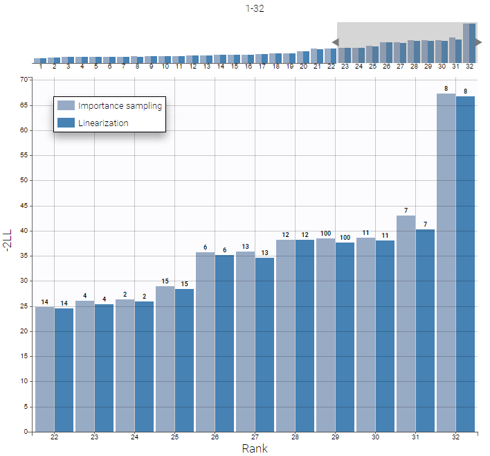
In the following example, the parameters of a one-compartment model with first-order absorption, linear elimination and a delay are estimated on the warfarin data set. The figure shows the top ten contributions from individuals to the log-likelihood, computed via linearization or importance sampling methods. All the contributions appear in small size on the mini-plot on top, as well as a window indicating the selection of individuals for the main histogram.
Here we notice that the subject with id 8 has a much higher contribution to the log-likelihood than all other subjects, meaning that its reponse is less well captured by the model than others. It is worth checking this individual in the plots of individual fits, and remove it from the data set if its observations look abnormal.

Settings
-
General. Add/remove the legend, grid, or a mini-plot that allows to select a range of ranks to display.
-
Methods. Add/remove histograms bins for values computed by linearization or importance sampling, if they have been computed.
-
Sorting. The user can choose to sort the histogram by index, or by contribution value computed with linearization or importance sampling, if they have been computed.
-
Label. The user can choose to display labels on top of the bins to indicate subject indices or names (ids).

