Adding horizontal or vertical lines on a plot
The plot connectors return ggplot objects which can be further customized by adding other ggplot elements on top. In order to be able to use ggplot functions, the ggplot2 library must be loaded.
Below we show several modifications on the prediction distribution plot.
The following elements are changed directly in the plot settings:
-
number of bands for the prediction interval
-
addition of the observations
-
modification of the axis labels
The following elements are modified using ggplot functions:
-
theme
-
position of axis ticks
-
addition of a horizontal line
library(lixoftConnectors)
library(ggplot2)
initializeLixoftConnectors()

# load project
loadProject(paste0(getDemoPath(),"/6.PK_models/6.3.multiple_doses/addl_project.mlxtran"))

# run to ensure results are available
runScenario()

# generate default prediction disribution plot
plotPredictionDistribution()

# generate customized plot
plotPredictionDistribution(settings=list(nbBands=1, obs=T,
                                         xlab="Time (hr)", ylab="Concentration (ng/mL)")) +
  theme_light() +
  theme(legend.position="none") +
  scale_x_continuous(breaks=c(0,24,48,72)) +
  geom_hline(yintercept=4, linetype="dashed", size = 1, color = "#9e2662")
The default display when calling plotPredictionDistribution() is:
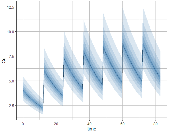
After customization, the display is the following:

Changing the order of subplots
By default, the plot connectors will sort the output plots lexicographically (alphabetically). In this piece of code, we are using the ggplot2 facet_wrap function to rearrange the subplots, so that the subplot of male subjects comes before the subplot of female subjects (by default, since F is alphabetically before M, the first shown subplot is the subplot of female subjects).
library(lixoftConnectors)
library(ggplot2)

initializeLixoftConnectors()

loadProject(
  file.path(
    getDemoPath(),
    "1.creating_and_using_models",
    "1.1.libraries_of_models",
    "theophylline_project.mlxtran"
  )
)

p <- plotObservedData(
  settings = list(
    mean = T,
    error = T,
    meanMethod = "geometric",
    timeAfterLastDose = T,
    ylog = T,
    lines = F,
    scales = "free_x",
    ncol = 2
  ),
  stratify = list(color = c("SEX"), split = c("SEX"))
)

p %+% facet_wrap(
  ~ factor(split, levels = c("#SEX:M", "#SEX:F")),
  labeller = p$facet$params$labeller,
  scales = "free_x"
)
Renaming legend items
In this case, we want to replace the legend items “SEX:M” and “SEX:F” with more meaningful strings “Male subjects” and “Female subjects”. We will also reorder the legend items. We are using the ggplot2 function scale_color_manual.
library(lixoftConnectors)
initializeLixoftConnectors()
loadProject(
  file.path(
    getDemoPath(),
    "1.creating_and_using_models",
    "1.1.libraries_of_models",
    "theophylline_project.mlxtran"
  )
)

p <- plotObservedData(
  settings = list(
    mean = T,
    error = T,
    meanMethod = "geometric",
    timeAfterLastDose = T,
    ylog = T,
    lines = F,
    scales = "free_x",
    legend = T
  ),
  stratify = list(color = c("SEX"))
)

levels(p$data$color) # get colors used in the legend

p + scale_color_manual(
  name = "Observed data",
  breaks = c("#4682B4", "#4D4D4D"),
  values = c("#4682B4", "#4D4D4D"),
  labels = c("Female subjects", "Male subjects")
)
Renaming subplots
By running this piece of code, we will get the observed data plot with subplot names “#SEX:F” and “#SEX:M” which we would like to change to something more meaningful, like “Female” and “Male”:
library(lixoftConnectors)
initializeLixoftConnectors()
loadProject(
  file.path(
    getDemoPath(),
    "1.creating_and_using_models",
    "1.1.libraries_of_models",
    "theophylline_project.mlxtran"
  )
)
p <- plotObservedData(stratify = list(split = c("SEX")))

p

We can define a list with new labels and change the labeller function to use the strings from the list:
new_labels <- list("#SEX:F" = "Female", "#SEX:M" = "Male")
p$facet$params$labeller <- function(labels) {
  labels$split <- new_labels[labels$split]
  return(labels)
}

p

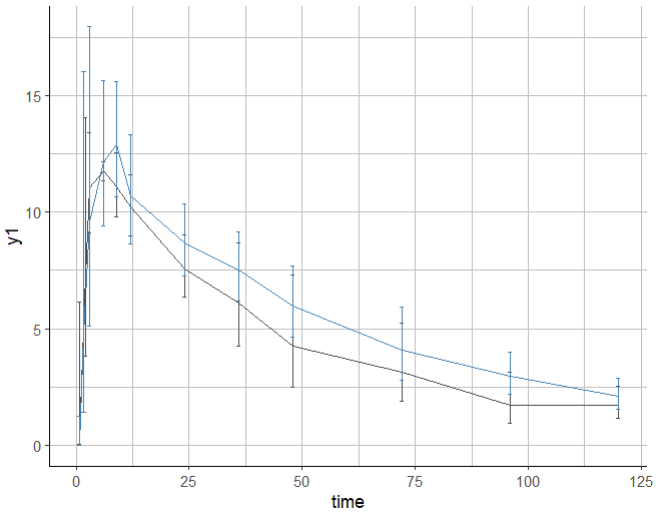
Dodging error bars
By default, when error bars are displayed and several groups are merged on the same subplot, the error bars are not dodged and can be overlapping making them hard to read.
library(lixoftConnectors)
initializeLixoftConnectors()
library(ggplot2)

loadProject(file.path(
    getDemoPath(),
    "1.creating_and_using_models",
    "1.1.libraries_of_models",
    "warfarinPK_project.mlxtran"
  )
)

p <- plotObservedData(obsName="y1",
  settings = list(
    mean = T,
    error = T,
    dots = F,
    meanMethod = "geometric",
    ylog = F,
    lines = F,
    binsSettings=list(is.fixedNbBins=T,nbBins=12)),
  stratify = list(split = c("sex"), mergedSplits=T)
)
print(p)
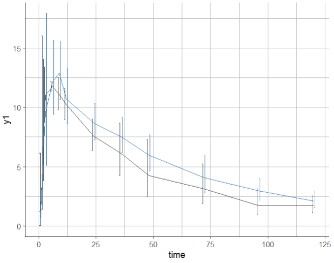
In order to dodge the error bars, it is possible to edit the corresponding layer of the ggplot object p. Note that to use ggplot functions, it is necessary to load the ggplot2 package in addition to the lixoftConnectors.
First inspect the layers to find the one that corresponds to the error bars: it is the one containing ymin = ~errorMin. Depending on what you have displayed on the plot, it can be the second or third layer for instance.
> p$layers
[[1]]
mapping: x = ~time, y = ~mean, colour = ~color
geom_line: na.rm = FALSE, orientation = NA
stat_identity: na.rm = FALSE
position_identity

[[2]]
mapping: x = ~time, ymin = ~errorMin, ymax = ~errorMax, colour = ~color
geom_errorbar: na.rm = FALSE, orientation = NA, width = 0.9
stat_identity: na.rm = FALSE
position_identity
Then change the position argument of that layer using position_dodge() and redraw the plot:
p$layers[[2]]$position <- position_dodge(width = 2)

print(p)
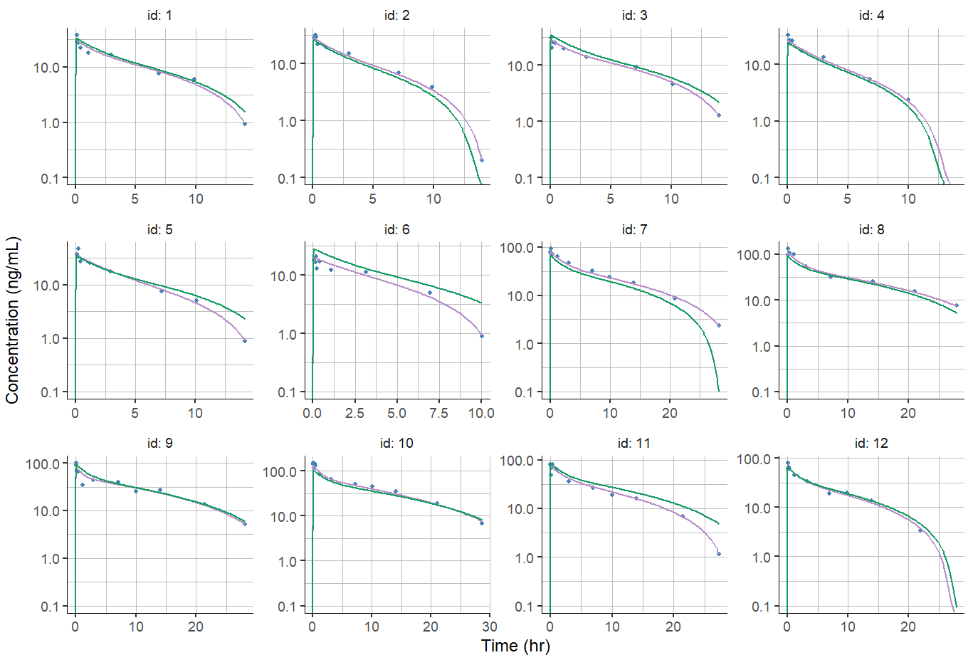
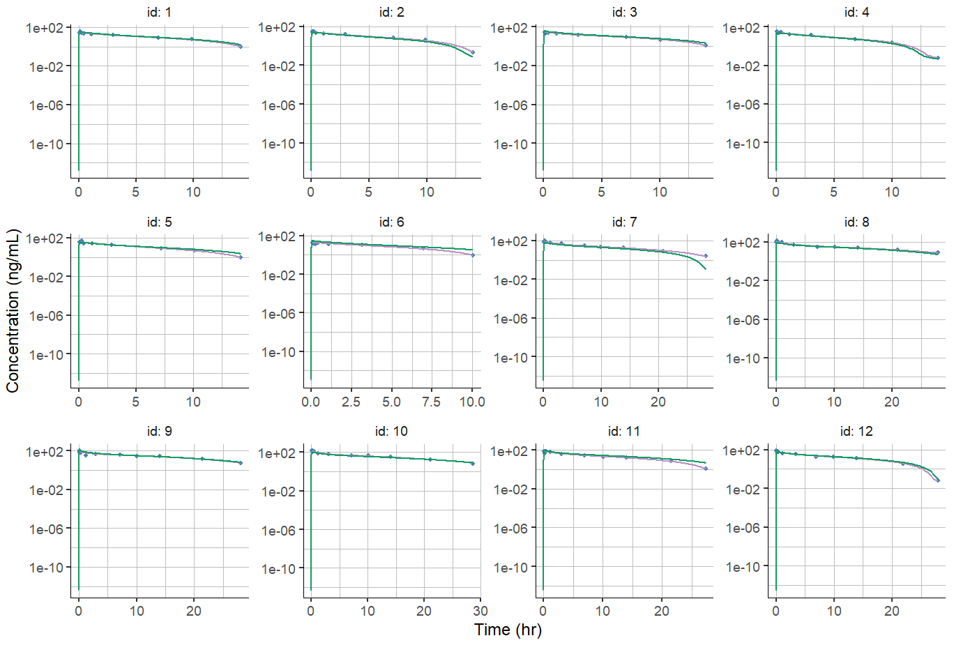
Ajusting axis limits for Individual fits
Individuals fits are often displayed using log scale for the y-axis. Due to the model prediction being usually zero at time zero, by default the y-axis limits span up to 1e-16, which makes the plot hard to read:
plotIndividualFits(
  settings = list(cens = TRUE,
                  popCov = TRUE,
                  legend = FALSE,
                  ylog = TRUE,
                  xlab = "Time (hr)",
                  ylab = "Concentration (ng/mL)"))
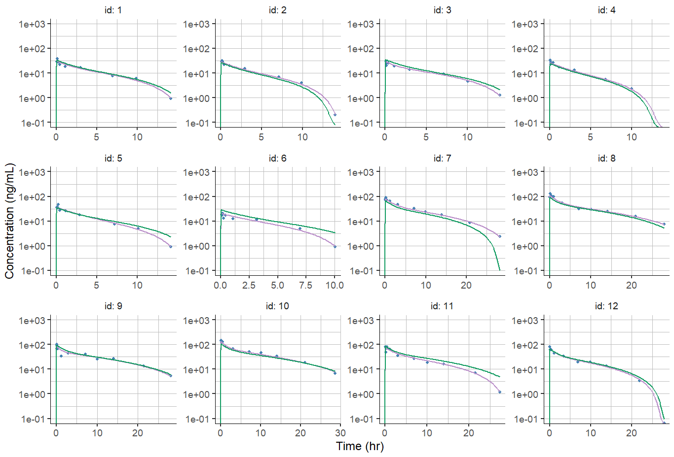
A possible solution is to specify the y-axis limits using the ylim argument, but this will apply to all individuals, which may be inconvenient in case of different dose groups and individuals concentration spanning over different order of magnitude.
plotIndividualFits(
  settings = list(cens = TRUE,
                  popCov = TRUE,
                  legend = FALSE,
                  ylog = TRUE,
                  xlab = "Time (hr)",
                  ylab = "Concentration (ng/mL)",
                  ylim = c(0.1,1000)))
Another option is to leave the upper bound of the ylim argument undefined (as NA), to let the plot choose automatically the upper limit for each individual based on the data and prediction, while enforcing the lower limit to be a specified value.
 plotIndividualFits(
  settings = list(cens = T,
                  popCov = T,
                  legend = F,
                  ylog = TRUE,
                  xlab = "Time (hr)",
                  ylab = "Concentration (ng/mL)",
                  ylim = c(0.1,NA)))